
ULTRAVIOLENCE LYRIC BOOK
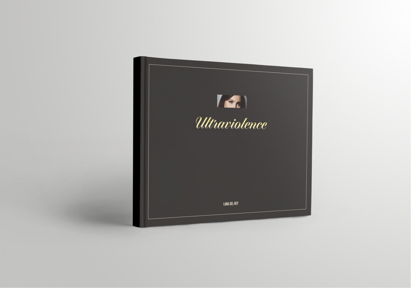
A concept collector’s lyric book for Lana Del Rey’s Ultraviolence, designed as a limited-edition companion to the vinyl.
Layout Design / Typography
The Brief
Design a lyric book in InDesign. I chose Ultraviolence because it’s the darker side of Lana’s old-Americana world: sultry, moody, and a little dangerous. Every decision in the book was made to match that.
The Concept
A limited-edition piece for fans, sold alongside the vinyl. The cover and back cover stay plain on purpose, so the inside, which is packed with words and imagery, feels like opening something.
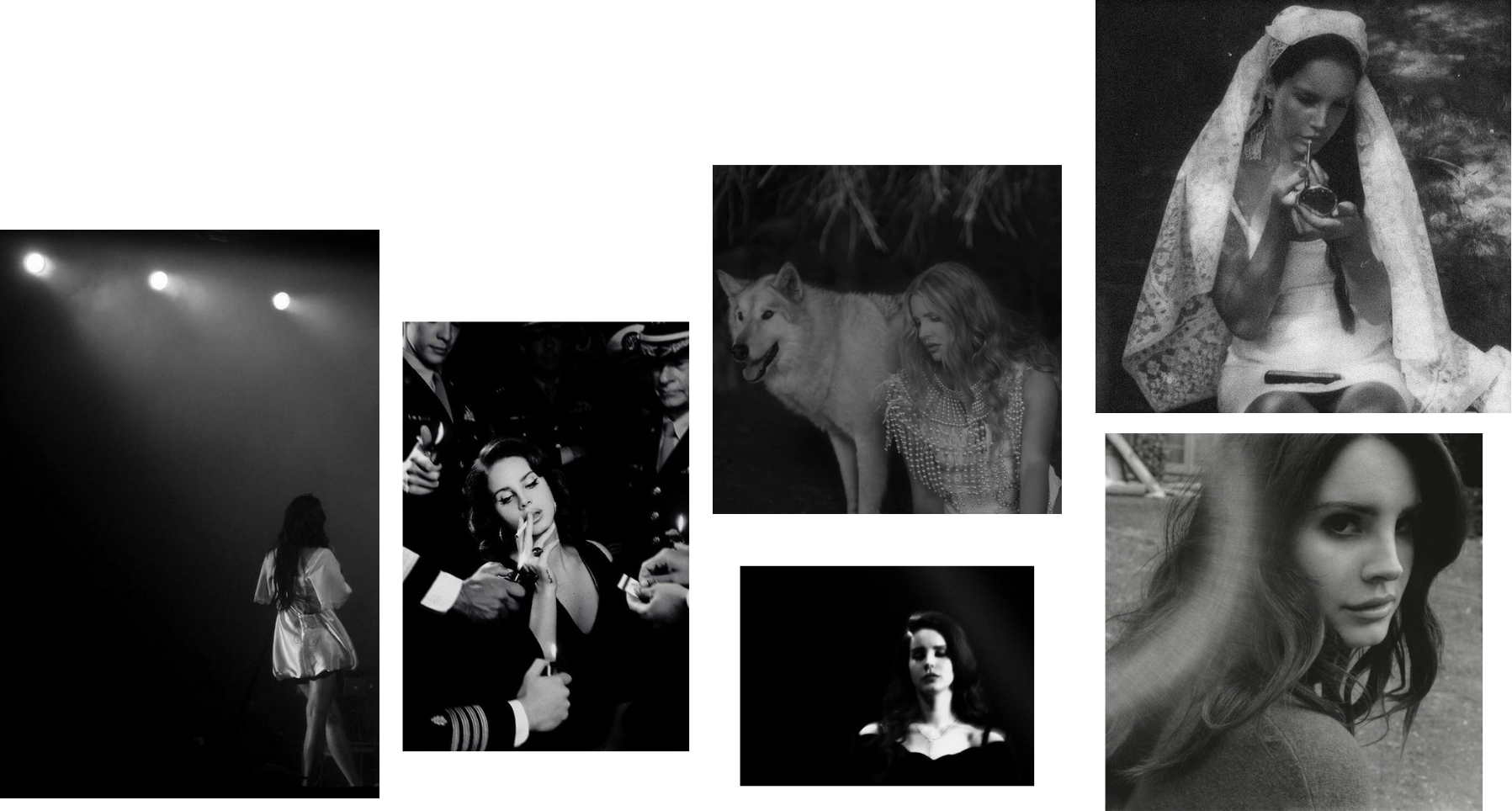
Image Direction
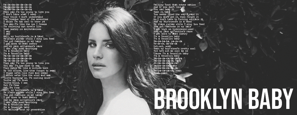
The imagery had to feel like the album, so I pulled from Lana’s edgier, moodier photoshoots and converted everything to black and white in Photoshop. Using one tonal treatment keeps different shoots looking like one world.
Layout Logic
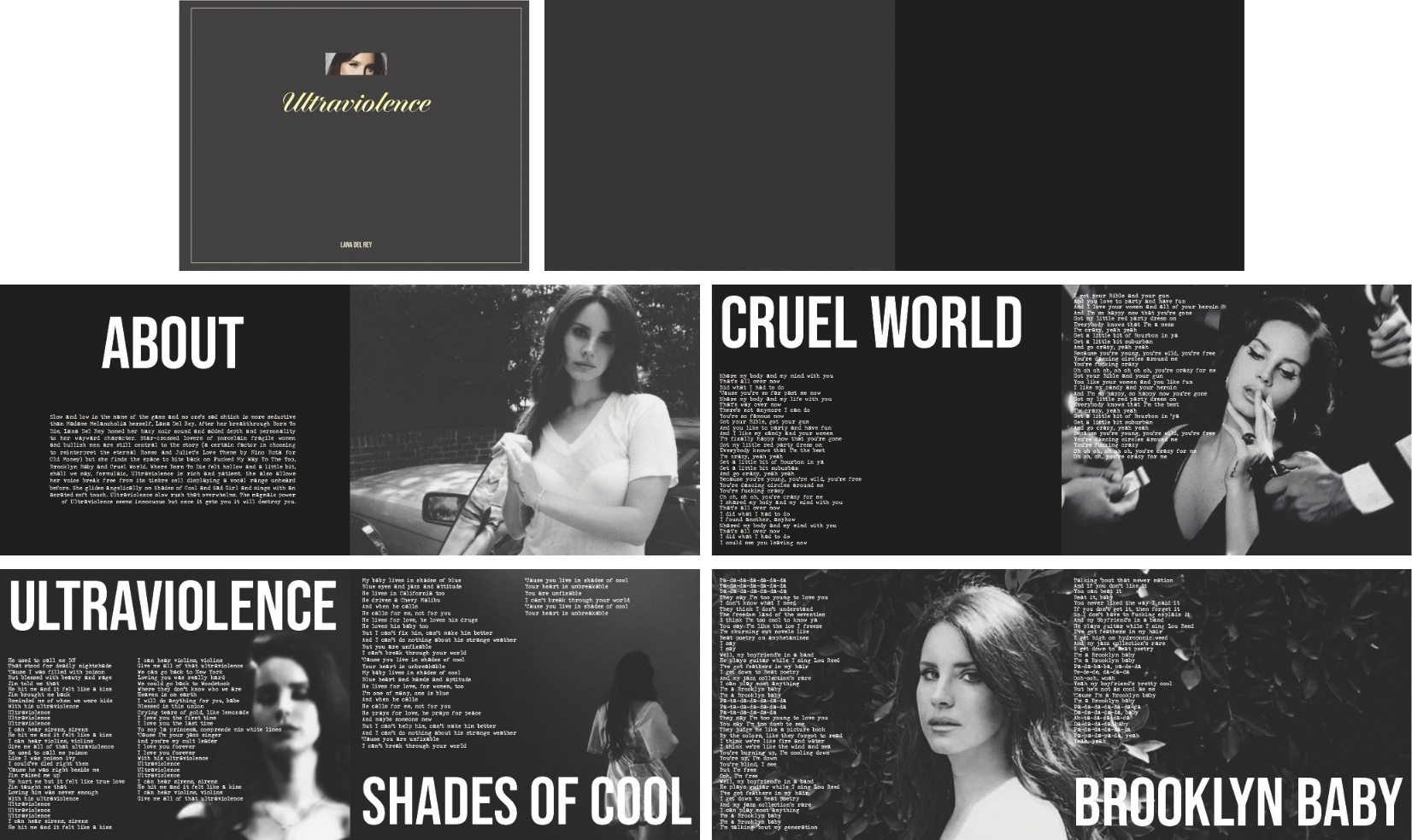
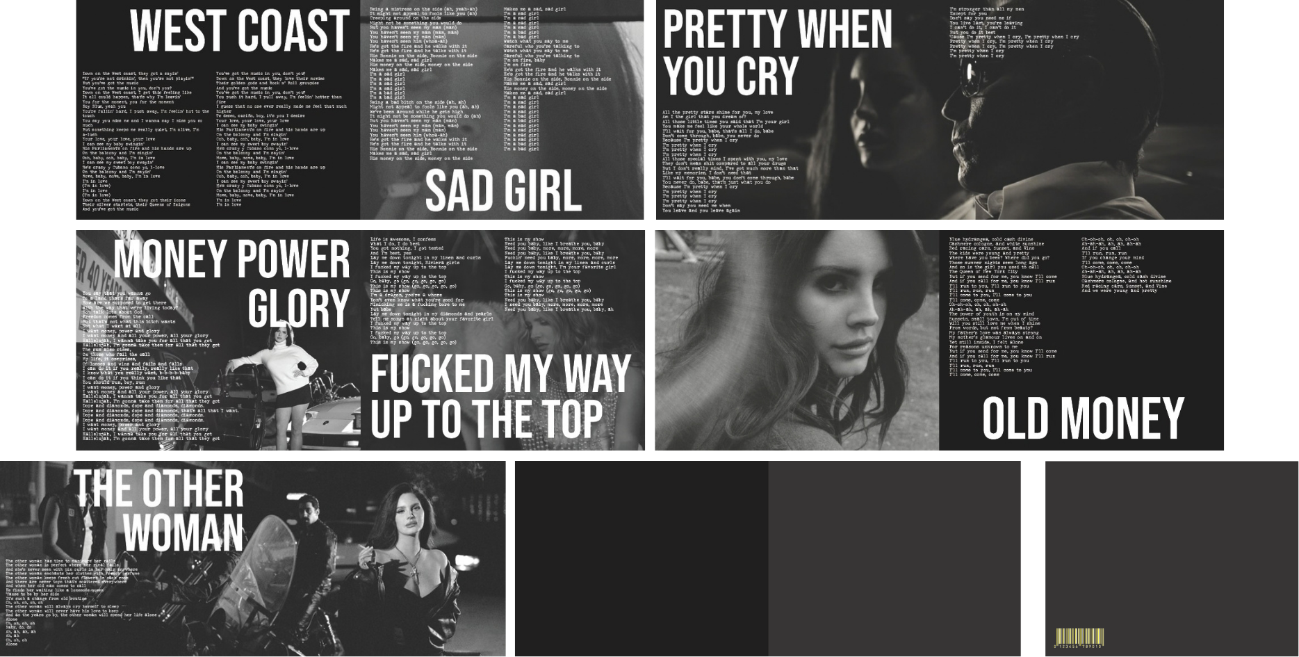
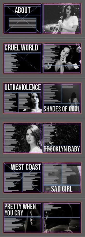
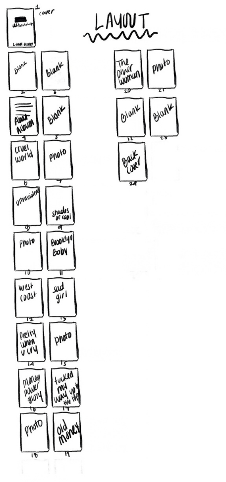
About eleven spreads, plus an About page before the lyrics begin. The rhythm changes as you turn the pages:
Solid black pages next to full-bleed images
Two different images on facing pages
Full spreads for the longer songs, so the text has room
Typography
Typography was one of the biggest priorities. I used the typeface Lana used for the album’s own branding for titles, and a typewriter-style font for the lyrics. She’s used that style in previous lyric books, so I stayed as close to her visual identity as possible instead of imposing my own.
Fonts
Title: Bebas Neue
Text: JohnDoe
Main Title: DunhillScript
Size
11 in x 8.5 in
The Process
I started with sketches of how the book would flow, then built grid layout tests in InDesign. Setting up the right page count is trickier than it sounds, so I mapped it out before designing. Then I built full mockups.
Tools: Adobe InDesign, Adobe Photoshop
Citations:
https://www.pinterest.com/pin/726064771193223985/ https://www.interviewmagazine.com/music/lana-del-rey-and-billie-eilish-fall-in-love https://www.pinterest.com/pin/8373949300249921/https://www.pinterest.com/pin/233202086945996685/ https://www.pinterest.com/pin/332984966215658221/ https://lanadelrey.fandom.com/wiki/2014/April?file=NK_1_1.jpg https://lanadelrey.fandom.com/wiki/2014/April?file=808be06b4eeac970-IMG_7254.jpg https://lanadelrey.fandom.com/wiki/2014/April?file=WC_1_4.jpg https://lanadelrey.fandom.com/wiki/2014/April?file=NK_The_Sun_13.jpg https://lanadelrey.fandom.com/wiki/2023/January?file=4_BIKES-NEW.jpg https://lanadelrey.fandom.com/wiki/Chemtrails_Over_the_Country_Club_(album)?file=COCCSingle.jpg https://stock.adobe.com/search?k=barcode&search_type=usertyped&asset_id=193566190 https://stock.adobe.com/search? filters%5Bcontent_type%3Aphoto%5D=1&filters%5Bcontent_type%3Aillustration%5D=1&filters%5Bcontent_ type%3Azip_vector%5D=1&filters%5Bcontent_type%3Avideo%5D=1&filters%5Bcontent_type%3Atemplate% 5D=1&filters%5Bcontent_type%3A3d%5D=1&filters%5Bfetch_excluded_assets%5D=1&filters%5Binclude_sto ck_enterprise%5D=1&filters%5Bcontent_type%3Aimage%5D=1&k=book+landscape&order=relevance&safe_ search=1&search_page=1&search_type=autosuggest&acp=0&aco=lanscape+book&get_facets=0&asset_id= 309988799


