
FAIRLIFE NUTITION SHAKES
Brand: Fairlife
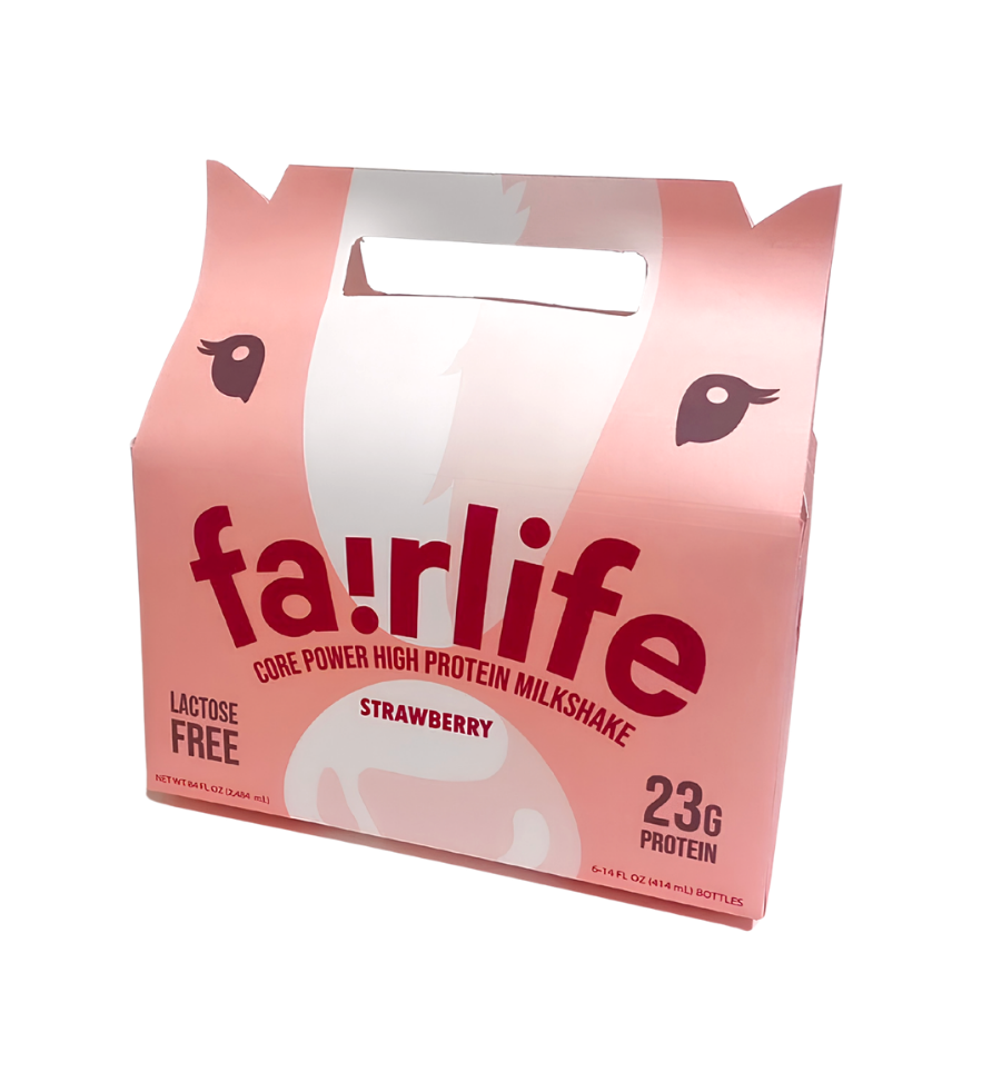
A concept packaging design for Fairlife’s small nutrition shakes: a six-bottle carrier built so the box itself becomes the cow.
Packaging Design
The Starting Point
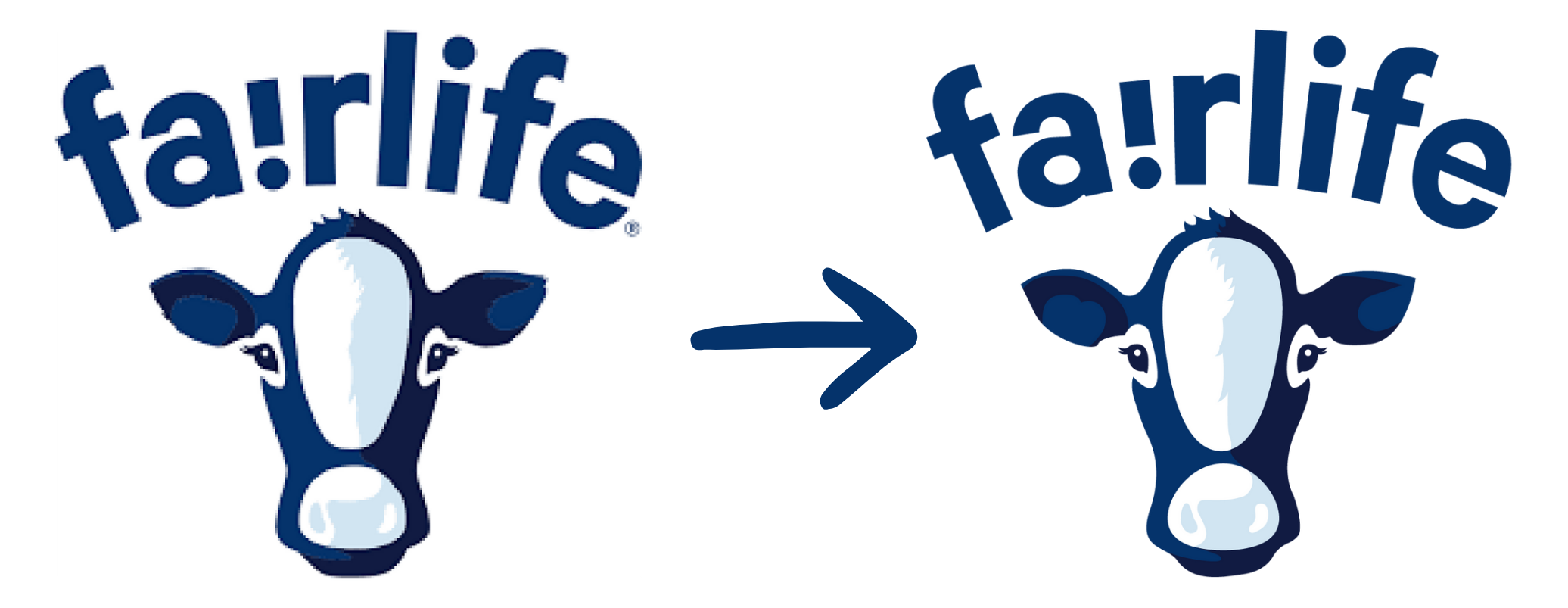
Fairlife’s packaging is simple and sleek, and the brand speaks to an 18-30 audience through that minimal look. Before designing anything, I rebuilt the logo. The only version I could find online was pixelated, so I cleaned it up in Illustrator and pulled out the cow so I could design with it.
Exploring Directions
The Choice
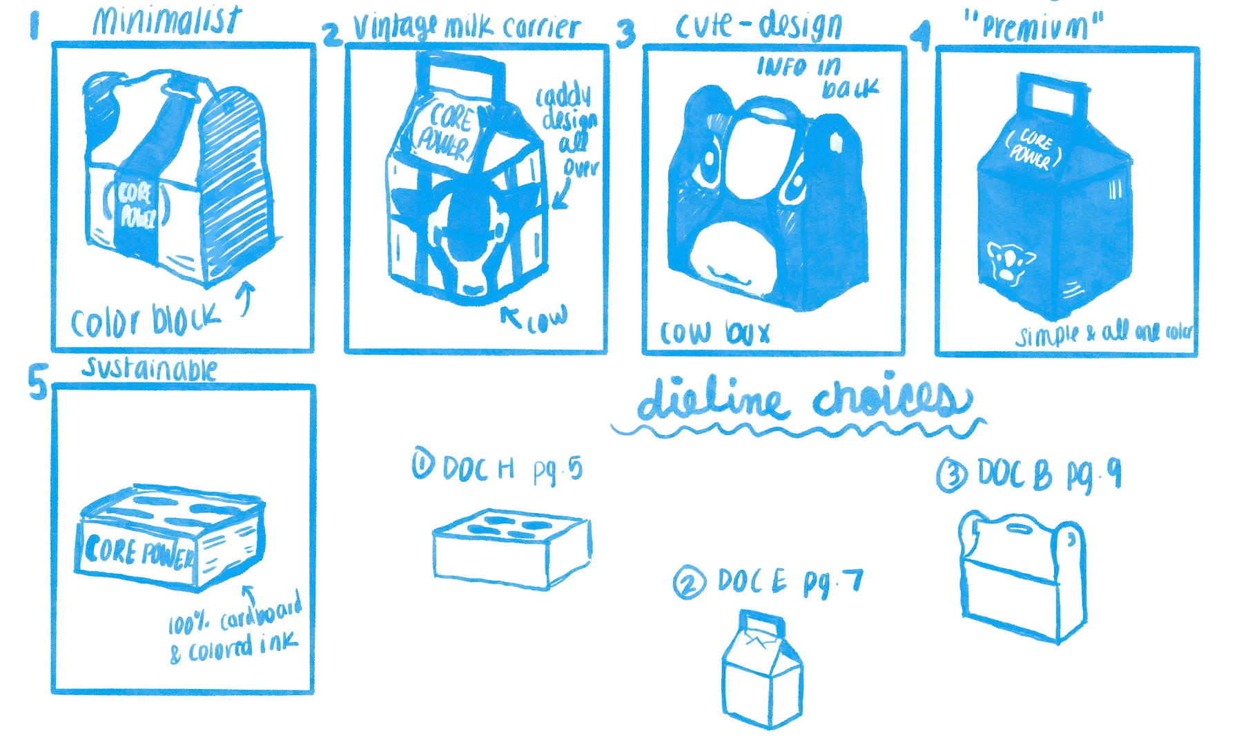
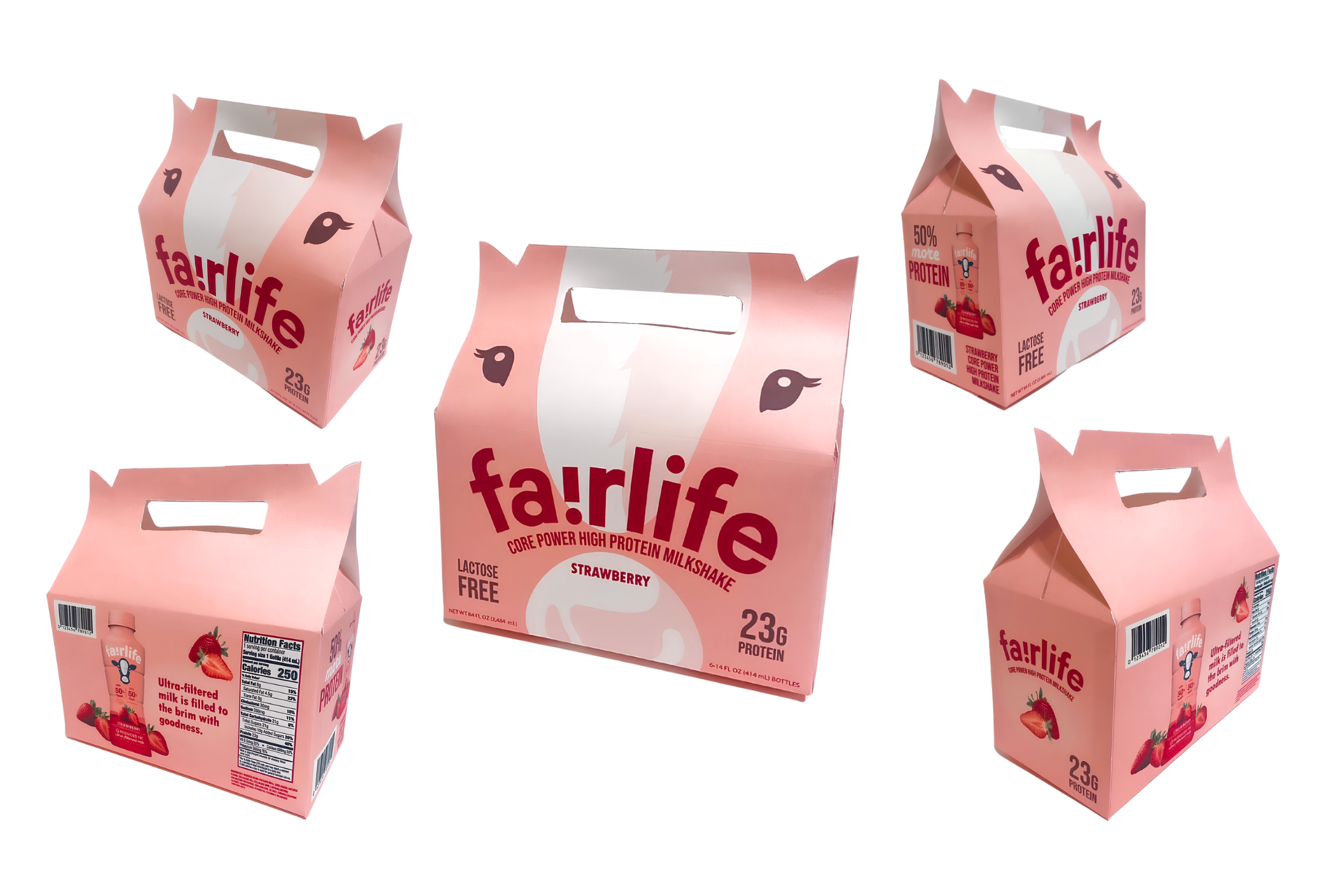
I went with #3, the Cow Box. The “cute” factor was the main draw: it appeals to Fairlife’s 18-30 audience, doubles as a practical carrier, and gives the brand something people want to post, which opens up more promotional opportunities. It holds six bottles, with the ears as the standout detail.
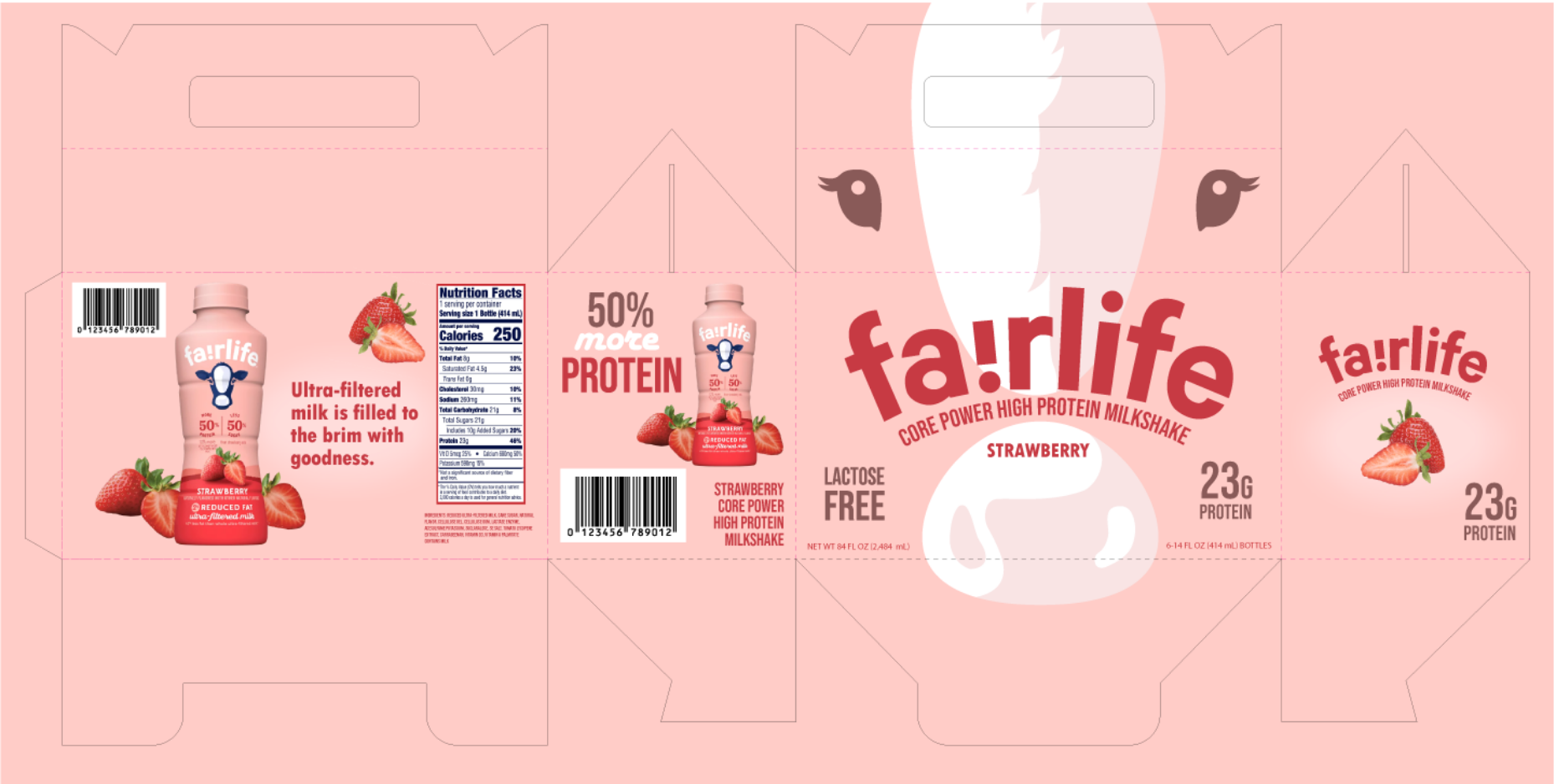
The Prototype
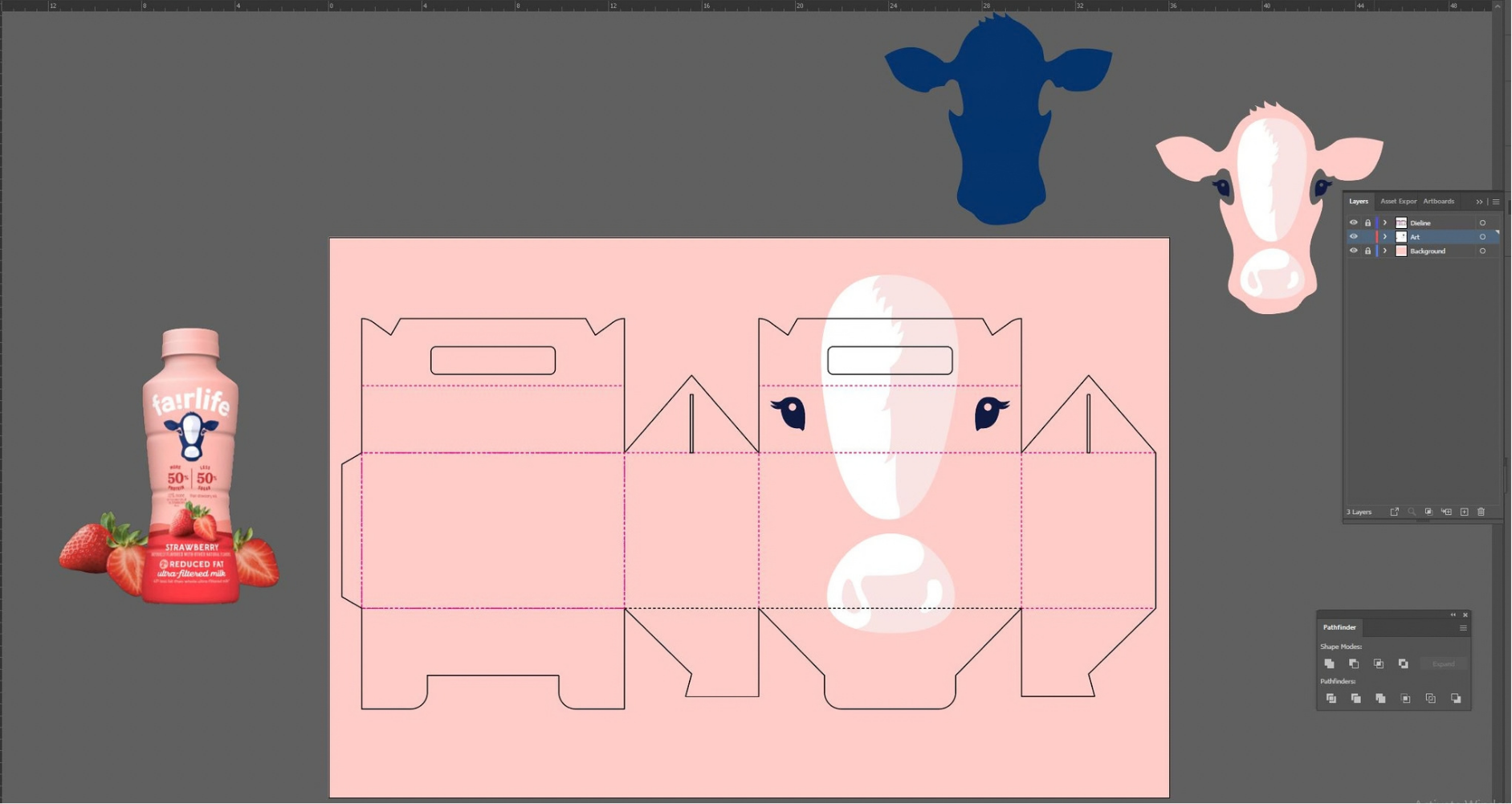
I printed the dieline and built the box by hand to test the structure. It’s construction paper, since that’s what I had. In production it would be sturdy cardboard.
Tools: Adobe Illustrator